

Natural England recently launched the Index of Multiple Environmental Deprivation, or IMED: a national picture of where communities face the greatest environmental pressures. It brings together; pollution, flood risk, environmental noise, habitat deficit, access to green space and climate-related heat into a single score for everywhere in England.
You can search for the following new indicators on Local Insight;
If you’ve used the Index of Multiple Deprivation, IMED is the environmental counterpart, and Natural England designed it to be read the same way. Higher scores mean greater environmental disadvantage. You can read their launch announcement here.
Natural England publishes IMED as detailed national maps on a 100-metre raster grid. That’s excellent for seeing fine spatial patterns, but harder to work with if you want a single figure for a neighbourhood, or to explore and compare IMED against other datasets held at standard geographies.
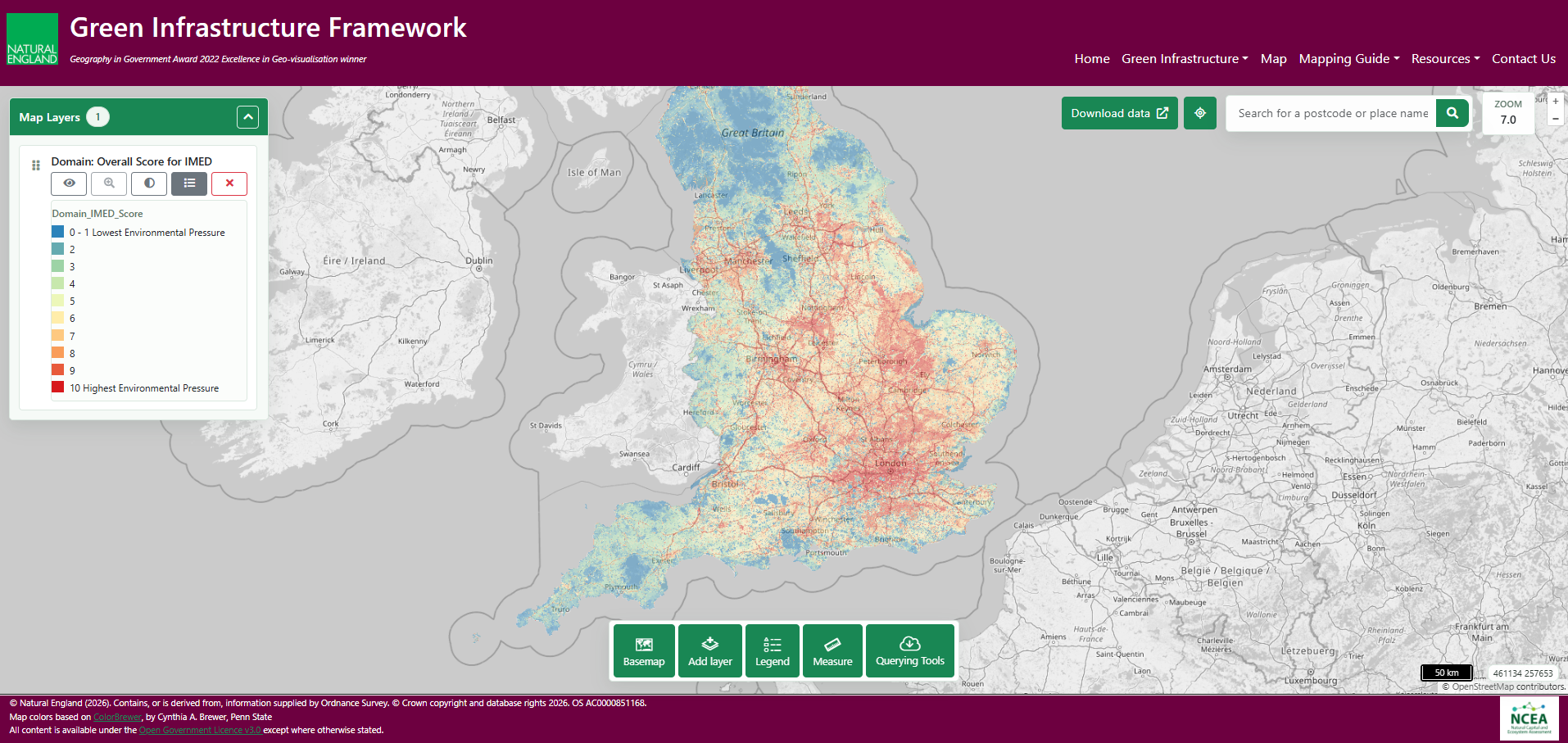
So we’ve converted IMED to Lower Super Output Areas (LSOAs), the same small-area geography as the Index of Multiple Deprivation. Every LSOA value here is calculated as the area-weighted mean of the grid cells that fall within it, following the aggregation approach in the Natural England Technical Information Note TIN235. The result is the overall index, its three themes (Pollution, Climate Risk and Nature Deficit) and all eight underlying indicators, each available as a score and a rank for every LSOA in England. We have also aggregated these scores and ranks to our other standard geographies on Local Insight. That means you can look up any neighbourhood, compare it against others, and combine IMED with the data already on the platform. Higher scores mean greater environmental deprivation, and it reads the same way as the IMD, with rank 1 being the most deprived.
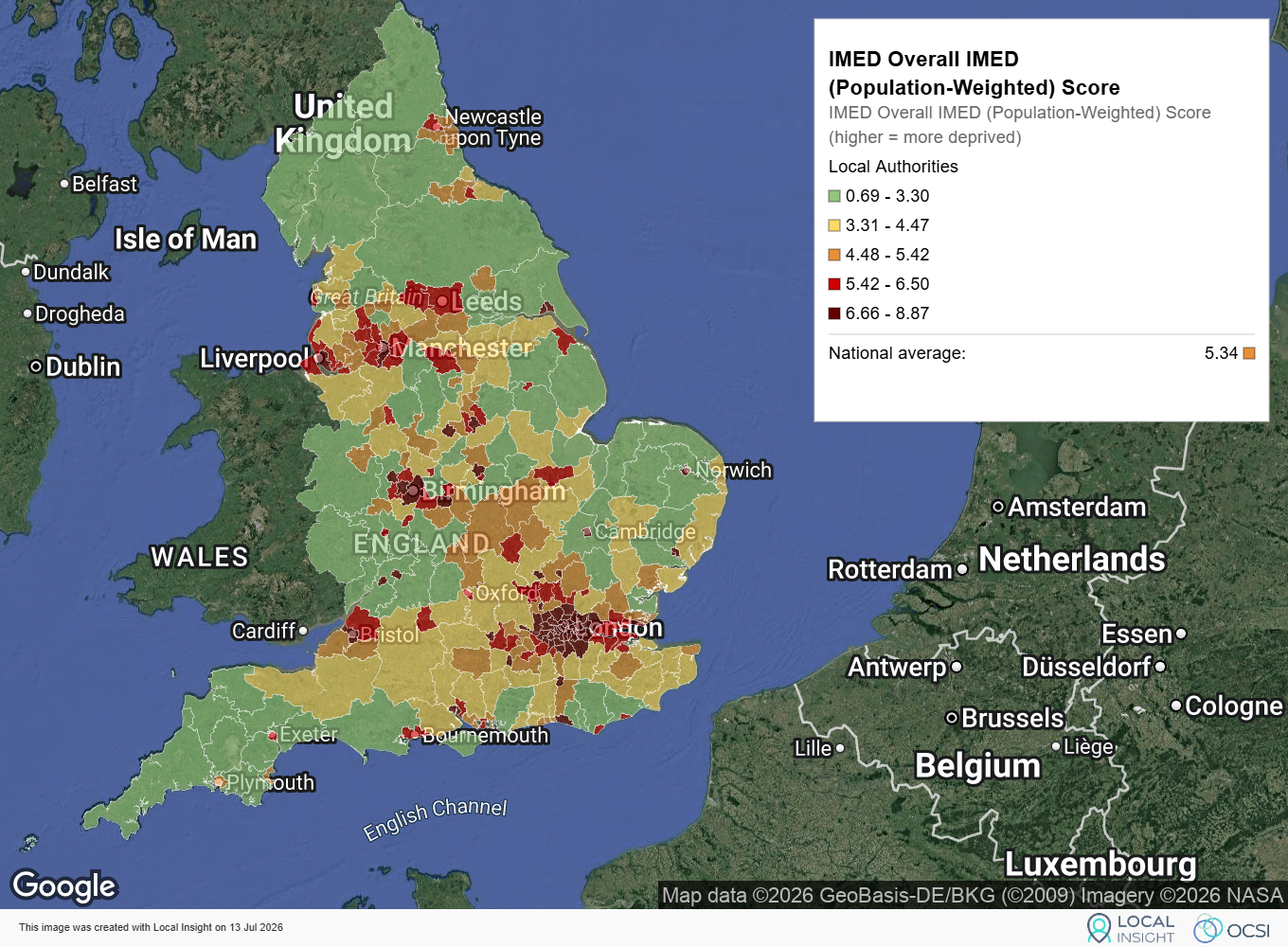
At the local authority level, IMED shows a clear pattern. Environmental deprivation concentrates in and around the major urban centres, most intensely across London, and through Birmingham, Manchester, Liverpool, Leeds and the other big cities. Rural England, the South West and much of the north outside the cities score considerably lower. It’s the geography you might expect once you consider what IMED measures: air pollution, noise and heat all tend to accumulate where population and traffic are densest. The national average score is 5.34. (Each local authority figure here is the population-weighted average of its LSOAs, our standard aggregation approach across the platform to reflect where people actually live rather than simply how much ground the LSOA covers.)
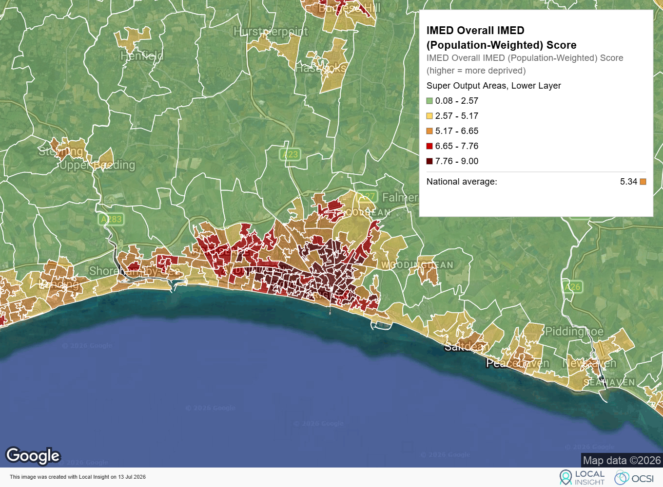
With OCSI based in Brighton and Hove, it’s the natural place to test the data against what we know. At local authority level, the city scores 6.81, well above the England average of 5.34, and among the higher-scoring authorities in the South East. That might surprise anyone who pictures Brighton for its seafront and the Downs on its doorstep, but it reflects what IMED measures: a dense, traffic-heavy coastal city carries real environmental pressures whatever green space sits nearby. Zoom to LSOA level, though, and that single score of 6.81 falls apart. Brighton and Hove contains some of the least environmentally deprived neighbourhoods in England and some of the most, often within a mile of each other. Scores run from around 0.75 in the greener suburbs up to nearly 9.0 in the dense central areas behind the seafront, close to the top of the national range.
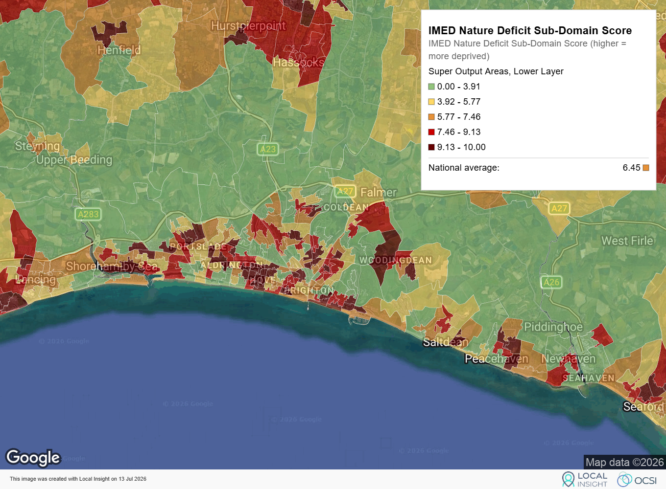
The detail also shows why the central areas score so highly; the pressure is driven less by flooding or climate risk and more by pollution and nature deficit. Several neighbourhoods, including in the dense centre, record the maximum score for lack of access to quality green space, despite the South Downs National Park sitting on the city’s doorstep. Proximity to open countryside, it turns out, doesn’t guarantee accessible green space within a dense urban core.
IMED scores look similar to IMD scores at a glance, but they’re built differently and shouldn’t be compared like-for-like. Natural England normalises every IMED indicator onto a fixed 0 to 10 scale, where 10 is the most environmentally pressured area in England and 0 the least. IMD, by contrast, uses its own scales for each domain, so a score of 7 in one means something quite different from a 7 in the other. One practical effect of IMED’s fixed scale is that many areas can share the same score, a reflection of the underlying indicators where large parts of the country can often record the same values. Where lots of areas tie on the same score they also share a rank.
IMED includes lack of access to green space as one of its indicators, and it feeds into the figures above as part of the overall picture. If green space access is specifically what you’re interested in, the platform also hosts it as a standalone indicator: both the measure Natural England used within IMED (the Scenario 7 access standard) and a more recent version based on a 15-minute walking standard. Those give you the underlying percentages directly, rather than as a normalised component of a wider index. IMED is the right tool for seeing cumulative environmental pressure at a glance; for a detailed look at any single theme, the standalone indicators go closer to source.
IMED won’t tell you why an area faces the pressures it does, or what to do about them. Like IMD, it’s a screening tool: a way to spot where environmental disadvantage concentrates, so you can ask better questions and focus on work where it’s likely to matter most. Combined with the deprivation and demographic data already on the platform, and with local knowledge of the places themselves, it’s a starting point for evidence-based conversations about where environmental investment could do the most good.
Explore the IMED within Local Insight for yourself or book a demo with us to find out more.
With Local Insight, you can add your own locations to the map,…
More
Where might communities need more support during extreme heat? Where is nature…
More
Local Insight is designed to be easy to use and intuitive, so…
More