
One of the core ways that Local Insight is used is to better understand how areas compare against one another.
Quintiles are one of the quickest ways to see where need is highest and lowest. They divide a dataset into five equal-sized groups, so each segment represents 20% of the dataset ranked from lowest to highest.
Until now, quintiles on the Local Insight map have always been calculated at a national level. While useful for benchmarking, national benchmarks can sometimes mask local variances.
With the new toggle for local quintiles, we hope to change that. Local quintiles work in the same way as national ones, but with a key difference: instead of splitting data into five groups across the whole country, they are calculated using only the areas you have selected on the map.
This means that:
You can now choose to calculate quintiles based only on your selected custom areas via the toggle in the legend.
First turn on the option to “Show data inside custom areas only”. When this is switched on, you will see the option “Limit quantiles to custom areas”, which is enabled by default.
When enabled, the map legend updates automatically and reclassifies the data using just those areas. This makes variation within your selection much clearer to see.
Using local quintiles fits naturally into your existing workflow. For example, if you are analysing deprivation across LSOAs in a single local authority, start by adding your custom areas to the map. Then switch on “Show data inside custom areas only” with “Limit quantiles to custom areas” enabled.
The map will immediately update to show the areas you’re interested in compared to one another.
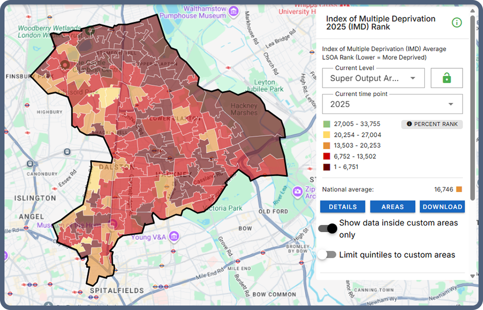
For example, taking a look at the IMD for Hackney below, we can see that many LSOAs rank in the 20% most deprived nationally.
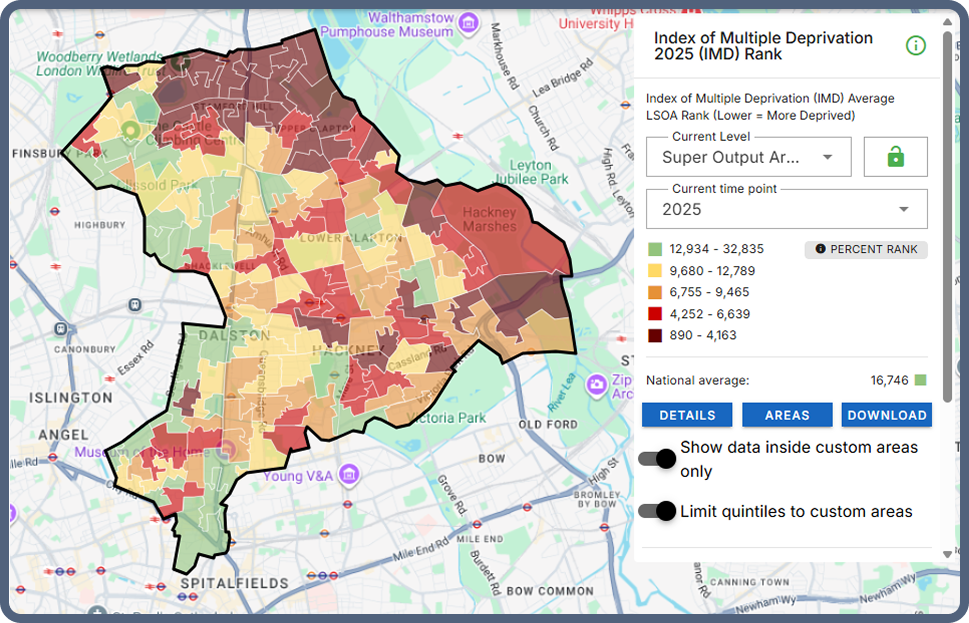
By switching to local quintiles, you can add more depth and see which neighbourhoods rank as the 20% most deprived within Hackney itself, showing a clearer concentration in the north of the borough.
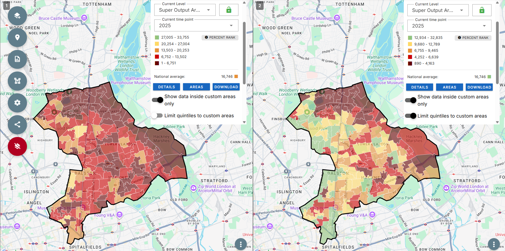
To take this a step further, we can combine this new feature with the multi-map functionality to enable direct comparison and enable the easy identification of areas that are both deprived nationally and locally in a combined view.
Local quintiles are particularly useful when:
However, you may want to keep the national view when benchmarking against national datasets or policies, producing reports that need consistency across multiple areas or if you are comparing places across different parts of the country.
If you have a Local Insight subscription, you can try this new feature out now within the platform.
If you don’t have a Local Insight subscription but you’d like to explore local quintiles, book a demo today.

Analysts are often under pressure to answer complex questions quickly, while also…
More
We have updated the Children in Low Income Families (CiLIF) indicators from…
More
The newly launched multi-map analysis feature within the Local Insight platform encourages…
More