
The newly launched multi-map analysis feature within the Local Insight platform encourages deeper exploration of the areas you’re working with – and easier identification of doubly-disadvantaged neighbourhoods.
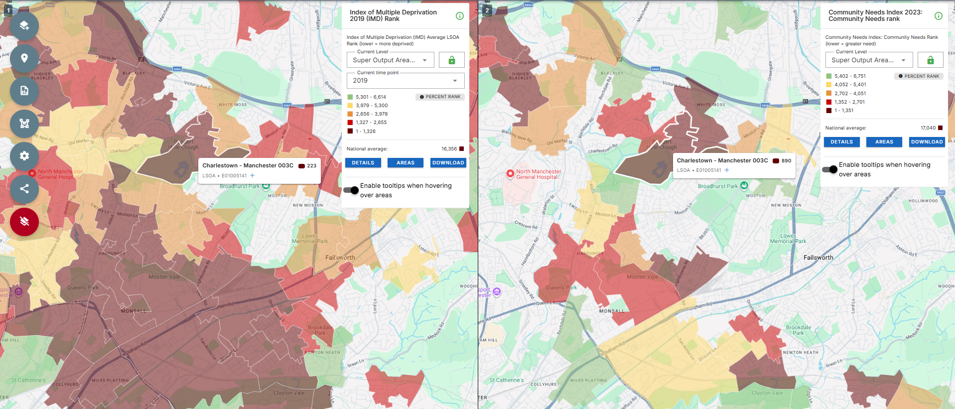
With the opportunity to visually compare and analyse two areas at once, we can better spot areas facing multiple challenges. For example, we can now examine both the Index of Multiple Deprivation and the Community Needs Index at the same time on the Local Insight map – enabling analysis that showcases why areas may have received Pride in Place funding.
Local Insight is designed to enable the exploration of the areas you care about. This new improvement can better support discovery of new areas of focus that face multiple challenges.
Exploring data on the Local Insight map begins with the data button. Here, you’re presented with a list of themes either created by OCSI, or curated by your team.
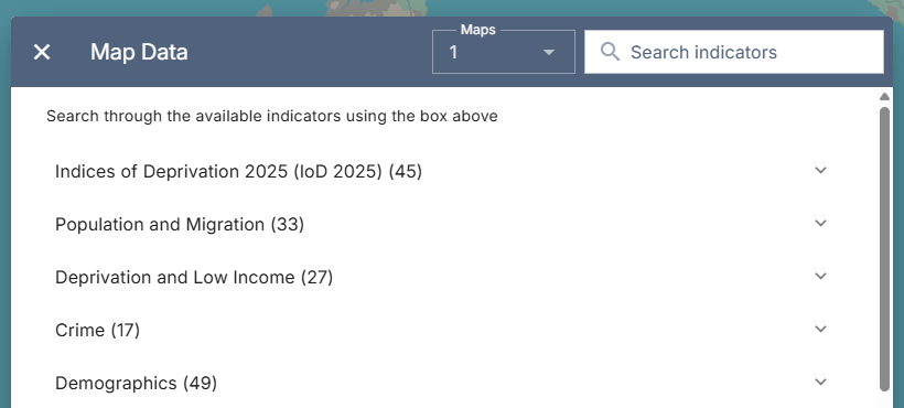
Above your themes, and to the left of the search function, you’ll see a dropdown list for ‘Maps’. It’s here that you’re able to choose to view more than one map at a time.
As of February 2026, two maps are available for multi-map comparisons – but we’re working on increasing this.
Once you’ve chosen to view more than one map via this dropdown, pick the indicators you’d like to view. For Pride in Place analysis, you’ll want to explore the Community Needs Index 2023, and the Index of Multiple Deprivation 2019 – as detailed within the methodology published by the Ministry for Housing, Communities and Local Government here.
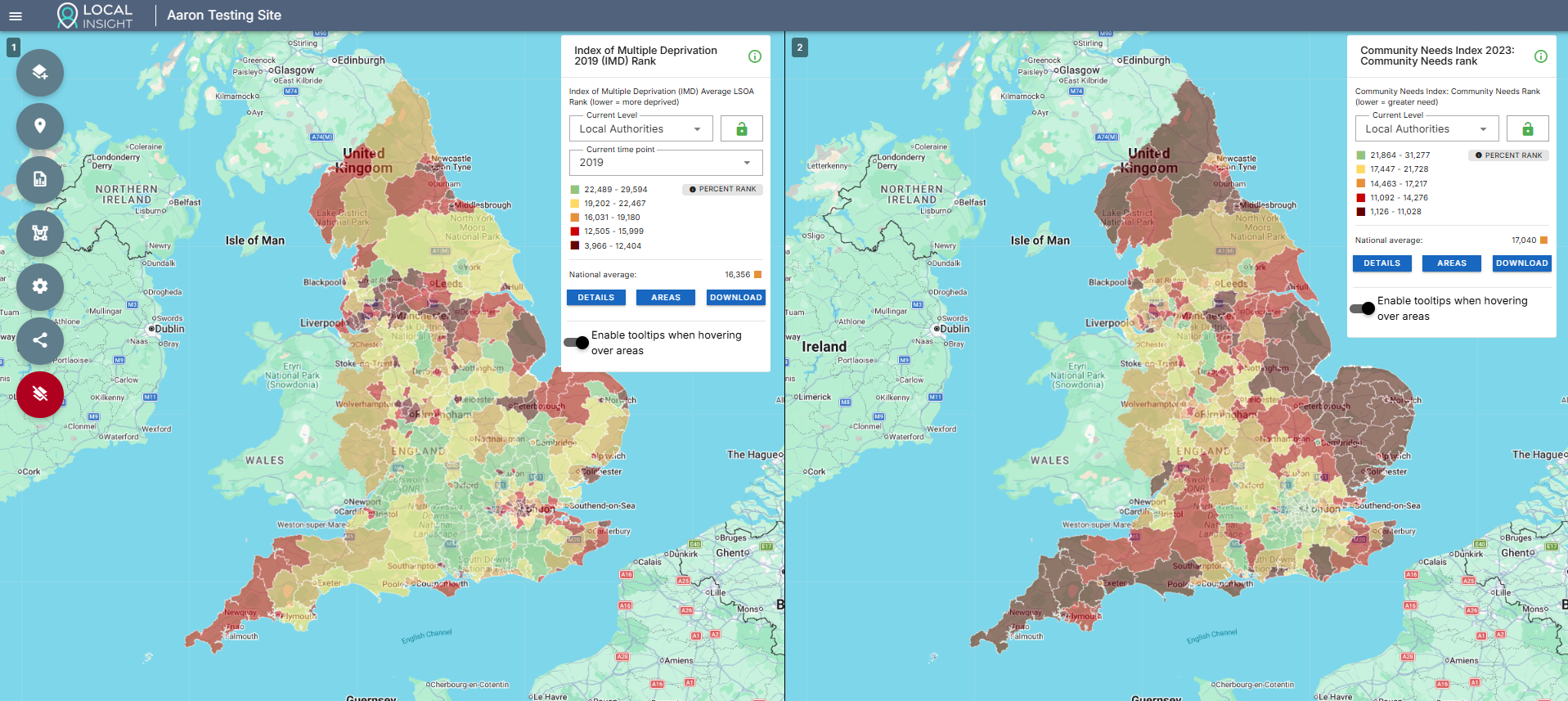
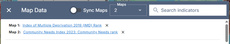
Should you want to view the two maps independently – just turn ‘Sync Maps’ off. This stops both maps from moving at the same time.
The maps provide compelling visuals for reports, funding bids and presentations. Using the screenshot functionality you can quickly and easily share your findings.The screenshot function works for each map individually, so you’ll need to take two screenshots and add them both to any reports you’re making. With ‘Sync Maps’ on, your screenshots will be identical.
Combining the multi-map feature with existing Services and hotspot features allows for even deeper exploration.
For example, you are still able to overlay your uploaded point location data via the Services function. This means that you can quickly identify the Services that sit in areas of high need across two different indicators.
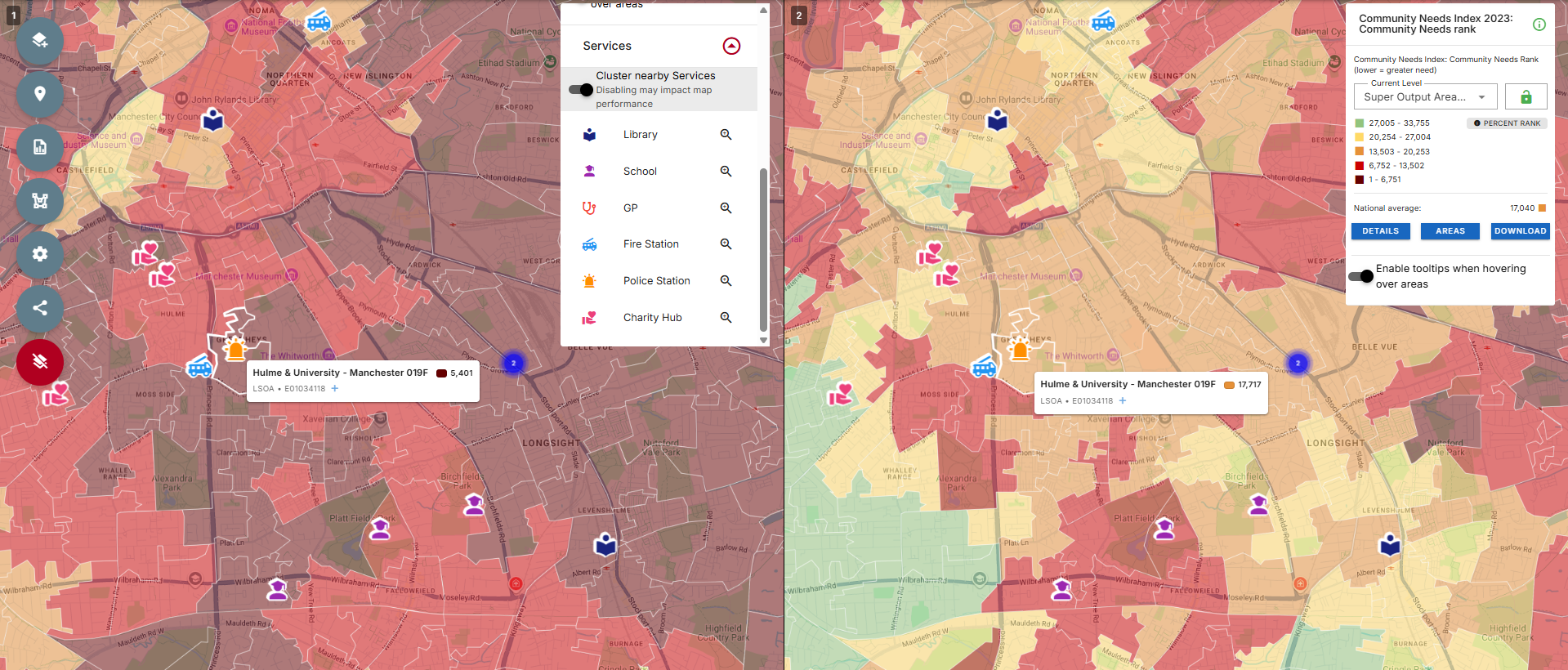
Alternatively, by turning on the ‘Hotspots’ option from the Settings menu, only the top 20% of regions are highlighted. If an area is appearing on both maps, we can recognise it as a potential area for investment or intervention.
This feature is now available to Local Insight users. Login here to start using it.
If you’re interested in a Local Insight subscription for your organisation and doing your own Pride in Place analysis, book a demo today and receive a personalised tour of the platform.

Brighton & Hove Food Partnership (BHFP) is a citywide charity that works…
More
You don’t need to spend hours making ward profile reports. If you…
More
There are a number of different methods that can be used to…
More